2021’s Spotlight Colors Paint Soothing, Natural Scene
The events of the previous year were clearly on the minds of taste makers at major paint manufacturers when they selected their annual colors of the year for 2021.
Themes of comfort and warmth as well as cheeriness and optimism are evident in selections aimed at creating a pandemic-minded palette for the homes we all spent more time in over the past 12 months.
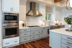
If you’re wanting to upgrade your home’s look or even planning a remodel, you may consider a few of these color suggestions. As part of our remodeling process, our designers help clients choose paint colors and help coordinate fixed room elements for a cohesive space you’ll love. During a home remodel, if one of the following colors is on your favorites list too, let your designer know.
2021 Color Trends

Benjamin Moore – Aegean Teal 2136-40
Sticking with its recent trend of choosing one color of the year plus 11 complementary hues to round out a dozen, Aegean Teal is the headliner of Benjamin Moore’s 2021 palette. A blue-green blended with gray, Aegean Teal aims to inspire relaxation and reflection as if one is gazing into the sea off the coast of Greece.
The rest of the hues also were chosen for their soothing nature, meant to convey warmth and wellbeing. “These are colors that make your home feel even more like home,” the company’s literature describes. “Settle in.”
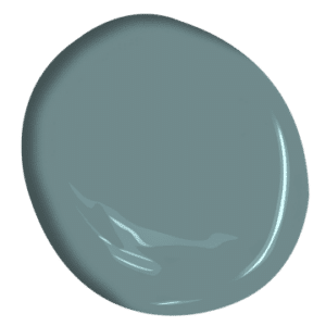
Behr – Canyon Dusk S210-4
If you’ve ever been fortunate enough to experience the awe-inspiring canyons of our country’s national parks in states like Colorado or Utah, or even just seen them in photos or on film, then you likely can close your eyes and picture Behr’s 2021 color of the year, Canyon Dusk (pictured above).
“Earthy and harmonious,” is how the company describes Canyon Dusk, with a goal of bringing the grounding feel of nature indoors. Taking things even further than Benjamin Moore, Behr actually selected 21 hues for 2021, beckoning homeowners to “journey through areas of inspiration.”
From “soft and serene” Smoky White (BWC-13) to “warm and approachable” Sierra (N240-4), Behr’s selections are aimed at helping you “elevate your comfort zone” with hues that are calming and subtle yet optimistic.

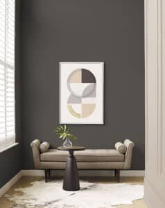
Sherwin Williams – Urbane Bronze SW 7048
Not to be outdone when it comes to the great outdoors, Sherwin Williams suggests we “tap into nature with a hue whose warmth and comfort breathe down-to-earth tranquility.”
Its color of year, Urbane Bronze, is a bold neutral that pairs well with other neutrals and bone whites, making it a great candidate for an accent wall. Sherwin Williams suggests using it alongside wood finishes and stone accents “to tie these earthy neutrals back to their nature-inspired roots.”
Valspar
Unlike others on this list, Valspar typically forecasts 12 colors for the year ahead without zeroing in on any one in particular, and that hasn’t changed in 2021. Last year’s selections were inspired by nature, an attempt to bring calm and tranquility into homes in hopes of offsetting the hectic, busy lives many people lead.
Their selections were made well before COVID-19’s arrival but couldn’t have been more prescient. For 2021, Valspar says its dozen hues are intended to make people feel “cozy and comfortable.”
While the 12 picks range from grays to yellows, most are neutrals and don’t stretch too far from the natural feel Valspar was going for a year ago. Take for example one of the selections, Spiced Latte. “Authentic and earthy, this warm neutral surrounds us with familiarity and comfort,” says Sue Kim, Valspar Color Marketing Manager.

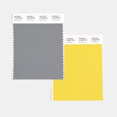
PANTONE 17-5104 Ultimate Gray
PANTONE 13-0647 Illuminating
Not a paint company, Pantone is best known for its proprietary color matching system used by designers, printers and manufacturers across the globe. Its business is color, and for just the second time, Pantone went with two colors of the year for 2021 instead of just one.
Ultimate Gray and Illuminating are two independent colors that can be used separately but will complement one another when paired.
“A marriage of color conveying a message of strength and hopefulness that is both enduring and uplifting,” is how Pantone describes arriving at the two selections.
Illuminating is a bright and cheerful yellow “sparkling with vivacity,” a shade that’s also “warming and optimistic.” Ultimate Gray, meanwhile, recalls “solid and dependable elements which are everlasting.”

From paint colors and finishes to room layout and design, the design-build experts at Tracy Tesmer are here to help each step of the way.
Contact us today!
