Decisions, decisions: Making the most out of the selections process
The selections process is what we call the system for choosing all of the products and materials that will be used in putting together your home or commercial remodel. This can be overwhelming for many, mostly because it’s sometimes difficult to know just where to begin. But being organized from the start is such an important step in making sure the project is successful and price is considered upfront.
That’s why at Tracy Tesmer Design/Remodeling, we take the time to meet with you in person, walk through the project, and create a design that meets your needs and fits your vision. Our process includes a material selection step which is where the selections process comes in. Our designers sit down with each client to choose materials, including plumbing and lighting fixtures, flooring, tile, cabinets, countertops, and paint colors.
But that doesn’t mean you can’t get the process rolling on your own if you choose. If you have strong ideas up front, it is best to tell your designer during the design phase. This can help more accurately reflect pricing in the proposal. For example, you may know you want to tile your bathroom floor in a herringbone pattern instead of the standard straight-lay, or you want to use a higher end quartz or quartzite and not granite for kitchen countertops. If you’re still looking around to help find what styles you like, let’s dive into some of the common starting points.
Where should you start?
Knowing where to start in the selections process can be difficult. If you have that one item you know you absolutely want, begin there and build a cohesive color and texture palette around it. Some common starting points are a specific cabinet color or a particular tile. You can even center the selections around an existing element such as a statement art or decor piece (like this blue fish shaped planter) that you know will stay after the renovation. Design/build professionals like those at Tracy Tesmer Design/Remodeling will then help you choose complementary finishes or materials, helping to ensure everything within the palette works well together.

Before a home renovation or remodel, many people look around for inspiration. When you are browsing different websites, stores and apps for ideas, think about the looks you save as favorites. Do you recognize a pattern or a particular style you tend to gravitate to?
Cabinets
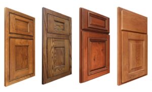
When choosing your cabinetry style in your new kitchen or bath, do you like a traditional look with raised panels, transitional style with shaker cabinets, or a contemporary style with slab door and drawer fronts?
Do these looks you’ve saved as inspiration have inset or full overlay doors and drawers? Are they painted, stained or a combination of both?
Do you like the all-time favorite all-white kitchen, or are you gravitating toward stain or color? You can’t go wrong with a near-neutral blue, or green cabinets have been in vogue the past several years and continue strong into 2022.
Tile
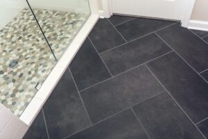 When deciding on a type of tile, we recommend picking something that is classic that you will enjoy looking at for years to come. Sometimes choosing something trendy and funky is enjoyable at first, but you may become tired of the look sooner than you would be with an option that is more simple. Tile is not as easy to change and replace like switching paint colors. Be sure to truly think about what style of tile will be long-lasting for your home.
Tile grout
Crazy enough, the color of your tile grout can significantly impact the overall design. When choosing a grout, you want to make sure it will work well with the tile you have chosen for your kitchen backsplash tile, bathroom shower tile, or floor tile. Standard tile grout comes in fewer colors, so your focus should first be on contrasting the tile or blending in with the tile. Then, select a grout color that goes well with the colors in the tile. Grout that appears so stark or off color from the tile can cause too much distraction and create a feeling that it doesn’t belong with the rest of the room. Even when you have a contrasting grout, you still don’t want that to be the first noticed focal point of the room.
Keep in mind, lighter grout will show stains and dirt more easily than medium to darker grout, and may require more upkeep. Choosing your tile grout color is another personal preference, but a professional can help you make the right decision for your taste and needs.
Countertops
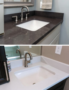 Another common starting point of a remodel is choosing your countertops. Again, the color and material you decide on depends on the look and functionality you are going for in the space you are renovating. There are numerous options when it comes to countertops, so we will cover a few basics. If you haven’t already, check out our previous blog on countertop materials: Get to know your options when considering countertop materials.
With many style variations, predominately white countertops can work for homeowners who are going for a contemporary or a traditional look. They also work well for smaller spaces and spaces with less natural light, because white can make a space look larger than it is. Darker-toned countertops work especially well if there are contrasting elements in the space with a few dark touches to tie it all together. Lastly, mid-toned colors such as gray or cream are extremely popular because they are the most neutral option and are especially versatile. They complement white, colored or stained cabinetry and work well with a variety of styles.
Paint Colors
Typically paint colors are chosen last due to the practically unlimited amount of colors available to choose from with all their slight differences. It is much easier to select items that may have less options first (tile/countertops etc.) and then find paint that coordinates well. If you are remodeling a single room in your home, be sure to choose a paint color that will work harmoniously with the surrounding rooms that can be seen through adjoining doorways.
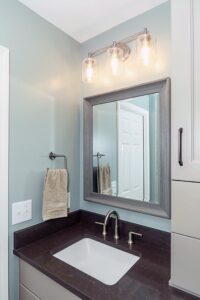
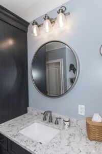
If you’re looking for more color than the typical neutrals shown on these most popular lists, Benjamin Moore’s Most Popular Paint Colors and Sherwin Williams’ top 50 colors, we recommend looking in the chromatic gray section. Keep in mind that what looks colorful on the color chip will most of the time look even more saturated and perhaps too vibrant once it’s on your walls. Here a professional can steer you in the right direction. Chromatic grays are not drab or dull like their name might imply. They can provide just the amount of color needed without being too overpowering. Here, for example, is a master bathroom remodel showing Sherwin Williams’ Oyster Bay.
On the other hand, focal points of your home are the places you can and should use more saturated colors, like kitchen islands, bars or changeable home décor. If there is a fun pop of color you have been dying to use in your dream home, this is where you could easily bring it to life.
As you can see, there is a lot to think about when making decisions during the selections process, and there is no wrong way to begin. If you are unsure of which options you like best, experts like those at Tracy Tesmer Design/Remodeling can help make the decision process a little easier.
Contact us today to discuss your vision and remodeling needs!