How to Mix Pattern and Color to Highlight Your Style
There are so many options when deciding on the interior design for your home that it can become overwhelming. Showing off a sense of style can be a bit intimidating when making long-term commitments such as tile, stone or even furniture. Highlighting your taste may seem more manageable when choosing the colors and patterns you want to use throughout your space. You just need the right combination of shades, shapes and sizes to create a vibe that complements you. There are a few simple principles that can help bring these creative aspirations to life.
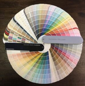 Start by Choosing a Color Palette
Choosing a color palette is the most important yet difficult part when decorating your home. Use a color wheel to help you decide on a color that best fits your personality and lifestyle. We recommend deciding on the color of cabinetry, tile, countertops and other “fixed” items, and then decor, furniture and rugs before deciding on a wall color.
For decor, simply pick a few shades that are the same in intensity and hue or a tone-on-tone color scheme. For example, you may decide to use beige, brown, and camel which are neutral colors, however the difference in tone gives depth to the space. When it comes to tile and countertops, selecting ones that play on contrast, texture, pattern, and a sophisticated look can aid in elevating the entire feel of a room. Nothing is more personal than color, so take some time to pick the ones that represent you best.
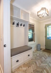
Placing your Patterns
A well-balanced room has both pattern and color distributed evenly throughout the space. Having too many patterns or colors concentrated in one area can make the space feel chaotic and unbalanced. Let your patterns have space to breathe. For example, if you decide on a patterned chair for your living room, choose a solid-colored pillow to accompany it instead of another pattern.
It is also best to use patterns in “touches” or small amounts throughout your space. The principle behind this idea is that the eye needs places to rest. If solid color is distributed evenly with these funky patterns, our eyes are able to “take a break” and appreciate the space without being too overwhelmed. So, don’t be afraid of patterns and trust your eyes. If the space feels comfortable to your own eye, then it should feel that way to everyone else, too.

 Spice it Up
When making your selections if you like pattern on pattern, a general rule of thumb is to choose three different ones (at most) that will complement each other. Start with your show-stopping pattern that will be the main focal point of the room. Once you’ve decided on the star of the show, pick two other patterns that will help bring it to life. When doing so, choose patterns that differ in scale and style so that a sense of hierarchy is created. Believe it or not, scale can really help pull an idea together by mixing shapes and sizes from large to small. Our homes would be so boring without patterns and color. So, go ahead and spice yours up!
Start Slow
Layering and mixing patterns and colors can be very exciting and a lot of fun! But, remember to take your time to really explore all of the different options and begin mixing your patterns slowly. It takes time to truly decide on what will complement each other and what will not. The most important thing is to bring all of these elements into the same space before you make your final decision. Otherwise, you may pick something that looks great on its own but doesn’t actually work with everything else planned for the room. Take a breath and enjoy the experience and magic of bringing a room to life!

The Right Tile for your Style
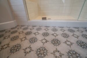 Tile is usually the statement piece of any space, so when choosing which style and pattern to use, consider all of the factors in the room. If your room is mostly white or neutral, a busier, flashy tile may be a great contrast. On the other hand, if your room already incorporates a lot of color and pattern, a more subtle tile may be your best bet. The scale of your patterned floor tile is also a very important consideration when making your decision, since it can make your room look larger or smaller depending on the individual tile size, shape and corresponding grout lines.
You can also use patterned tile as a backsplash in your kitchen. Again, when making your decision, consider the entire kitchen. What is the current (or planned) style and color palette of the space? If your kitchen already has a lot of bright and bold features, like vivid cabinets, fantastic light fixtures, bright stools and shiny appliances, then your backsplash may need to be more subtle and classic to balance it out. More neutral, white kitchens could use patterned tiles to add a striking feel to the design.
For more direction in regard to the selections process, check out our blog, “Decisions, decisions: Making the most out of the selections process.”
If you are considering a home remodel and are interested in mixing patterns and colors, give Tracy Tesmer Design/Remodeling a call. We will talk through and explore all of the many options that will make your space feel like a home!
Click here to contact us!